6

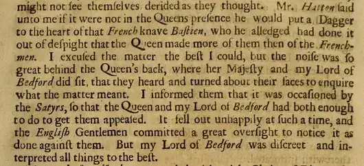
I was browsing through some very old English texts when I came across this page from The memoires of Sir James Melvil of Hal-hill, by George Scot (1683). The first thing that struck me was the anatomy of the capital letter Q in Queen. Its elongated tail dips well below the base line, and if you peer closely at the fourth Q you'll see it curl slightly upwards. It's not the first time I have seen a similar font but I was wondering if that particular letter style had a name.

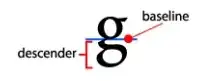
I know that lowercase letters that extend beyond the baseline are called descenders, but I didn't find any information about uppercase letters with flamboyant diagonal tails and ‘legs’,
image of a lowercase g like the ‘K’ and ‘R’ in Kingdom, King, Retreat, Reader and Retriev'd.

  • My last question; in the text you'll notice that each of the following nouns and adjectives: Hatten, French Knave, Bastien, Frenchmen, Bedford, English Gentlemen and Satyrs are in italics and each word begins with a capital letter. Why is that? When did this trend end?

I read this question Capitalisation of nouns in English in the 17th and 18th centuries and although it talks about the craze for capitalizing “important nouns”, it doesn't mention anything about italicized nouns.

relevant text containing four instances of "Queen"

Mari-Lou A
  • 91,183
  • Where do you find these books, I'm curious to know? I read that, similar to what Josh stated, Italics was considered elegant, and to Capitalize and Italicize was used to Emphasize words. Dunno if it's true, though. T'was on some site. – anongoodnurse Nov 11 '14 at 08:14
  • @medica visit "Google Books", type an old fashioned/archaic word, use the tool which limits your time search; i.e. 18th century or write the actual years in the custom feature. You should find plenty of examples. – Mari-Lou A Nov 11 '14 at 08:46
  • 2
    @medica On Friday evening the speaker at our local Historical Association was Dr Stella Panayotova, Keeper of Books and Manuscripts at the Fitzwilliam Library, Cambridge. Her topic was The Macclesfield Psalter. This small prayer book is one of the finest illuminated manuscripts to survive from the 14th century. It was discovered in 2004 on a bookshelf at Shirburn Castle, the home of the Earl of Macclesfield, in an 18th century binding. Neither he, nor anyone had the faintest idea it was there. It was just that you asked 'where do you find these things?'. All around us! – WS2 Nov 11 '14 at 08:49
  • 1
    @medica https://www.google.co.uk/search?q=macclesfield+psalter&num=50&tbm=isch&tbo=u&source=univ&sa=X&ei=cdBhVNu-C8XaPPScgLAF&ved=0CDMQsAQ&biw=1280&bih=687 – WS2 Nov 11 '14 at 09:03
  • @Mari-LouA Next time you are in Cambridge, call in at the Fitzwilliam. Stella is a Bulgarian. You would be interested to meet her. – WS2 Nov 11 '14 at 09:17
  • 1
    It seems unlikely to be a coincidence that the italicised nouns are exactly the proper nouns. (Well, Satyrs could be disputed). – Peter Taylor Nov 11 '14 at 10:33
  • @PeterTaylor if you click on the second link, the opposite format is used. Proper nouns, e.g., James, England is in normal type, while the rest of the text is in italics. But, yes Satyrs doesn't fit in the scheme. And "French Knave" and "English Gentlemen" are surely adjectives. – Mari-Lou A Nov 11 '14 at 10:46
  • @PeterTaylor thanks to your comment I realized my slip up re. nouns. – Mari-Lou A Nov 11 '14 at 10:52
  • This Meta discussion makes it look like typography is off-topic, especially when it's not really about language. There's no indication that the distinctive Q is semantically significant. I'd suggest asking on Writing or Graphic Design instead? – curiousdannii Nov 11 '14 at 12:31
  • @curiousdannii so why is there the typography tag? There are 89 questions tagged. My question is: "I was wondering if that particular letter style had a name." I'm asking for a specific name of a thing i.e. "terminology". I'm also asking about the capitalization and italicization of certain nouns. Orthography! Another EL&U tag. :) – Mari-Lou A Nov 11 '14 at 12:37
  • @Mari-LouA Because tags are very hard to kill! – curiousdannii Nov 11 '14 at 12:37

3 Answers3

6

It appears that the style you are referring to is actually from the 16th century:

  • Garamond is the name given to a group of old-style serif typefaces named after the punch-cutter Claude Garamont, (also spelled as Garamond, Latinised as garamondus) (c. 1480–1561). Garamond’s letterforms convey a sense of fluidity and consistency. Some unique characteristics in his letters are the small bowl of the a and the small eye of the e. Long extenders and top serifs have a downward slope. –

  • The first Roman type designed by Claude Garamond was used in an edition of the Erasmus book Paraphrasis in Elegantiarum Libros Laurentii Vallae published in 1530. The Roman design was based on an Aldus Manutius type, De Aetna, cut in 1455 by Francesco Griffo.

  • After Claude Garamond died in 1561, most of his punches and matrices were acquired by Christophe Plantin from Antwerp, the Le Bé type foundry and the Frankfurt foundry Egenolff-Berner.

  • A direct relationship between Garamond’s letterforms and contemporary type can be found in the Roman versions of the typefaces Adobe Garamond, Granjon, Sabon, and Stempel Garamond.

Garamont type-style.

The use of italics for some nouns may derive from the style in vogue during Renaissence times. Italics was popular in handwriting ad was probably used in printing because of its elegance and clear reference to an 'erudite' style.

  • The humanist spirit driving the Renaissance produced its own unique style of formal writing, known as "cursiva humanistica". This slanted and rapidly written letter evolved from humanistic minuscule and the remaining Gothic current cursive hands in Italy, served as the model for cursive or italic typefaces. As books printed with early roman types forced humanistic minuscule out of use, cursiva humanistica gained favor as a manuscript hand for the purpose of writing.The popularity of cursive writing itself may have created some demand for a type of this style. The more decisive catalyst was probably the printing of pocket editions of Latin classics by Aldus Manutius.
  • 2
    The typefaces Garamond produced between 1530 and 1545 are considered the typographical highlight of the 16th century. His fonts have been widely copied and are still produced and in use today. - Linotype – anongoodnurse Nov 11 '14 at 07:56
  • Concerning your second paragraph; it's talking about the italic face type, whereas I'm curious as to why only some nouns were italicized in the excerpt I posted. – Mari-Lou A Nov 11 '14 at 09:03
  • @Mari-LouA - I added my comment to the answer!! –  Nov 11 '14 at 09:29
4

The actual typeface appears to be one of Caslon's (cf. the reconstruction of the opening to In Catilinam Prima, reproduced below), but the more general answer to your question is that the flourishes you noted are called swashes.

enter image description here

Caslon
  • 41
  • 3
    Thank you for the term, swash, but I fear the typeface, Caslon, was created after the book was printed: "Caslon's earliest design dates to 1722" – Mari-Lou A Nov 11 '14 at 11:03
  • I would like to see the actual type. Normally all the characters are the same depth with the characters without descenders having a blank piece of metal below them to take up the space. It would seem that the typefaces with swashes under some letters must have had no such blank metal below the character, that spacer bars must have been added below characters without either descender or swash and characters with swashes must have been 'L' shaped. That must have made setting typefaces with swashes very slow. No wonder they went out of use! – BoldBen Dec 10 '22 at 04:06
1

CAPITALIZATION and ITALICS:

The capitalization of nouns in early modern English-language printed works is similar to that of modern German, a usage that began in the seventeenth century, and is a likely source of the English-language practice.

Italics is somewhat more complicated. It was often used in printed English texts in the 17th and 18th centuries to indicate direct quotation, always without quotation marks. I don't know the source of this practice, but it is possible that it was used for emphasis.

One also encounters peculiar instances of italicization that go back to the handwriting convention -- especially prevalent in Latin manuscripts -- of indicating "strikeouts" by underlining, especially to correct errors made by the writer / copyist. (Almost anyone who studied Latin in the 1950s and earlier was taught this.) Underlining, of course, was before computers -- and still is for many people -- the equivalent of italics; and I have seen instances in print in which material that was underlined in a manuscript and should have been omitted was printed in italics.